What the chart shows
The chart plots the cost of transport, the metabolic energy a moving body spends per unit of mass per unit of distance, against body weight, on logarithmic axes. Mice sit high on the chart because small bodies are expensive to move. Horses and salmon do better. Jet fighters and automobiles land in the middle. A walking human is unremarkable: approximately 0.75 calories per gram per kilometer.
Put that same human on a bicycle and the figure falls to approximately 0.15, roughly five times lower, below every animal ever measured. Nothing about the person changed. The infrastructure changed.
1970 to 1973: Tucker and Wilson
Biologist Vance Tucker published the underlying comparison of animal locomotion in 1970. Three years later, in the March 1973 issue of Scientific American, engineer S. S. Wilson extended the analysis to machines in an article titled Bicycle Technology, and the bicycle’s datapoint became one of the most quoted results in transportation science.
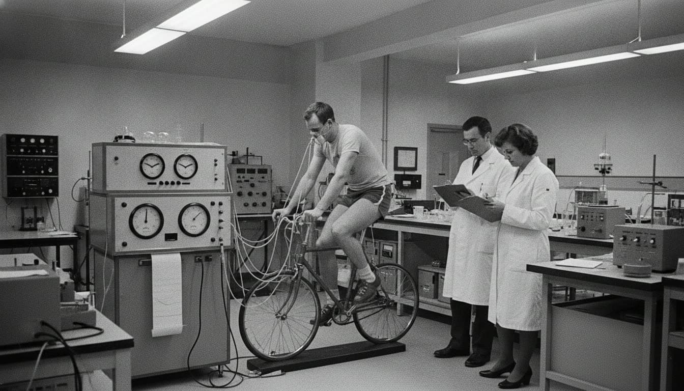
The bicycle for the mind
Steve Jobs retold this study for years. In his telling, the condor was the most efficient traveler and the human ranked unimpressively, until a human on a bicycle blew the condor away. That, he said, is what a computer is: a bicycle for our minds. The chart you are looking at is the source of one of the most famous metaphors in computing.
Why the bicycle wins
Walking is a controlled fall. Each step raises and lowers the body and brakes against the ground, and that work is thrown away. A bicycle supports the body’s weight on wheels, converts muscle effort into smooth rotary motion, coasts on stored momentum, and uses gearing to hold the legs near their most efficient cadence (Wilson, Bicycling Science). The result is the cheapest transport per gram per kilometer ever measured for any animal.
2025: the revisit
In 2025, Scientific American returned to the graphic under the title Human on a Bicycle, updated with vehicles and half a century of hindsight. The conclusion had not moved. This site is named after that chart, and our visualization above redraws the comparison independently: the two human values are verified anchors, and the remaining datapoints are approximate values read from the published literature.
One caution
Cost of transport measures locomotion efficiency, not electrical generation. A cyclist is a spectacular traveler and a terrible power plant, which is the entire premise of our white paper. If you want to know how many riders your AI workload would require, the capacity calculator will give you a number you will not like.
Frequently asked
- What does the human on a bicycle chart show?
- It plots the cost of transport, the metabolic energy an animal or machine spends to move one unit of body mass one unit of distance, against body weight for swimmers, fliers, walkers and runners, and vehicles. A walking human costs approximately 0.75 calories per gram per kilometer. On a bicycle the same human drops to approximately 0.15, below every measured animal.
- Who created the original chart?
- Biologist Vance Tucker published the underlying animal comparison in 1970. Engineer S. S. Wilson extended the analysis to the bicycle in his March 1973 Scientific American article, Bicycle Technology. Scientific American revisited the graphic in 2025 under the title Human on a Bicycle.
- What is cost of transport?
- Cost of transport measures metabolic energy per unit of body mass per unit of distance, commonly expressed in calories per gram per kilometer. It is a measure of locomotion efficiency, and it is distinct from electrical-generation efficiency.
- Why is cycling so much more efficient than walking?
- Walking spends energy raising and lowering the body and braking each step. A bicycle converts effort into smooth rotary motion, supports the body's weight on wheels, coasts, and lets gearing keep muscles near their most efficient cadence. The biology is unchanged; the infrastructure around it improved.